What Colour Schemes Work with Shabby Chic?


The first thing to bear in mind is that shabby chic is not restricted to just one particular style or theme. Let us remind ourselves of just what shabby chic actually is both as a concept and in relation to furniture specifically.
Shabby chic is an interior design ethic or style that derives its charm from items that have that ‘lived in’ look and may be worn or distressed. Aged, or aged appearing items are often selected. Shabby chic has its origin in the 1980s when it first made a significant impact in the world of interior design.
A word that is commonly heard in association with shabby chic is ‘comfortable’ and that seems to fit very well with the underlying ethos. Soft, relaxed, romantic, and nostalgic are other words used in conjunction with this style of décor. That said proponents also often refer to softer ‘feminine’ styles of shabby chic with the words mentioned before and more ‘masculine’ styles characterised by a preponderance of natural or burnished wood, coarser fabrics such as sailcloth and burlap and darker colours.
There are several different directions or variants of the style recognised, such as ‘beach cottage’ and ‘French country’ to name but a couple. The styles, materials and fabrics that are used will vary depending on the style assuming one wants to avoid a jarring clash of different ones.
From this it can be seen that the colour scheme that works will depend very much on the particular sub-genre style that is being aimed for. We can explore some of the more common variants.
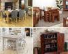
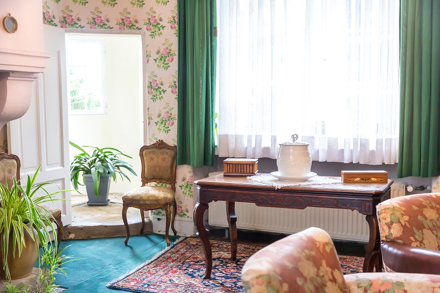
Consider the standard, middle of the road, working kitchen/dining area of a certain era a few decades ago. You can picture in your minds eye the check patterns of the light cloths covering tables and sideboards. For this kind of room, the colours will be lighter, more pastel tones. It will work well with white furniture, possibly slightly distressed. In terms of other accessories items such as china with floral patterns and scalloped edgings will go well with this motif. Light blues, pinks, yellows, and greens fit in perfectly. Chairs with more graceful, curved lines on the legs complement such décor. The pastel theme can continue from the fabrics to the furnishings themselves with splashes of white to accentuate relevant areas and features. The ambience to go for here is the comfortable, traditional, relaxed pace of a family home in less frenetic times.
Closely related is a more floral theme. The colours once again the blues, pinks, and yellows with maybe a little room for slightly brighter hues. This brings to mind the tea rooms of a by gone, more graceful era. With both the floral and the more middle of the road theme any white furniture may fit better if slightly distressed. The odd bright white item helps add to the authenticity and feel of a room lived in and created over time changing but slowly.
Comfort can also be derived from soothing neutral tones complemented by the solidity of exposed, unpainted wood. Fabrics and coverings of a more solid patterned grey, black or tan/brown are appropriate here. Wooden surfaces may be smoothed or can be roughened by a degree of sanding to bolster the lived in and used feel.
An air of long ago, slightly faded decadence with a colonial tinge can be evoked with clever usage of white as the dominant colour. Decorate the backs of comfortable, fabric chairs and sofas with white antimacassars and add slip off protective covers of the same hue to the arms of the furniture. In a room like this wicker furniture works very well. For a minority of the items maintaining the natural colour of the wicker helps break up the lines somewhat but the bulk of the wicker should be painted a bright, matte white shade.
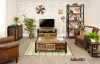
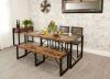
An alternative version of the shabby chic style is the rugged, predominantly brown, heavy wood appearance. Much of the furniture here will be distressed and formed of heavy, recovered woods such as from railway sleepers. Fittings of darkened iron staples and handles on tables are common in this style of interior design. Light cotton is generally eschewed in favour of solid, plain heavy linen or canvas cloths. Floor coverings and rugs can be patterned to give visual impact and tend to be of darker colours, deep brown, greens, purples, or blues with a preference for the earthier tones.
The heavy, deep brown of aged and treated railway sleeper furniture also segues into what is known as the ‘industrial style’ of shabby chic. In this style more rustic colours, greys and neutrals tend to dominate. In addition to the colour palette a striking feature of this style is the tendency to have partially exposed flooring or walls as if worn away by heavy usage or machinery. As well as the treated wood items that look unfinished and rough to the touch are appropriate. Light fittings tend to be floor based and metal with an exposed, metallic pipework motif sometimes used. Copper is a good colour for this style.
It is important to bear in mind that the whole position of shabby chic is based around the idea of rooms that are genuinely used and lived in. These are rooms that while yes, they have been knocked around and have some rough edges and are not finished to perfection, they are also continually living and evolving spaces. As such it can be useful to acknowledge change by splashing around the occasional vivid, brightly coloured item. This contrast can add a pleasant, visual, slightly off kilter shock and make the room feel more like a home than a dry showroom. As an example, pieces of wood could be painted bright lime and small sections exposed through the cushions, throws or other covers on them. Throw rugs or scattered cushions for comfort can be used to introduce a splash of shocking pink, electric blue or flame red and orange. While the overall room theme is generally congruent with one or another overarching design it is important that the living space has individuality and flair as well, these shock effect additions can help with that.
